1. Too much information on one page
When making a report, higher management is often asked what they want to see. Usually you will be told: everything! The creator of the management report gets to work, with the result that all information that is available is put on a page. Management information, financial information, schedules, issues, risks, everything is shown on one page. Due to this overkill of information, the report is difficult to interpret and can focus on matters of less importance. Ask the management in advance which indicators they want to control. Make sure these indicators are clearly visible on the cover page of your report. The most important part of your report should be given the most space. As with so many things in life: less is more! You can show any detailed information in underlying worksheets.
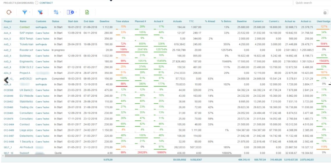
Too much info on one page
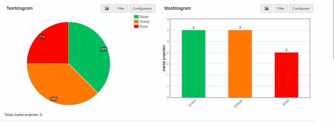
At a time when information is coming to us in an ever-increasing amount and at an ever-increasing speed, the use of visual aspects is a must. Make it easy for your reader by using graphs, tables, pictures and colors. This allows you to ensure that amounts of information can be interpreted in an easy and fast way. Also make sure you choose the right visual aspects. Research shows that the popular pie chart is difficult to read. This is because our brains have a hard time noticing differences from round shapes. If possible, always choose a bar chart.
Lagging indicators are actual values from the past, while leading indicators are predictive values from the future. An example of a lagging indicator is, for example, the completed projects of the past period. An example of a leading indicator is the expected expenditure of your project (Estimate at completion). Often this information is displayed interchangeably. When taking (management) decisions it is better to divide these over separate reports. The lagging indicators can then help evaluate past goals while leading indicators can help increase the chances of success in the future.
4. Not the users but the availability of data is taken as the starting point
Because we keep track, we only report on it, "is often used as an argument. Talk to the user of your report to find out what he or she really wants to know. Often these are 2 or 3 indicators. A report reporting on 8 different types of traffic lights is no exception in my daily work. Often parts of these traffic lights are the cause or effect of other parts and therefore unnecessary to report.
“Because we keep track of it, we also report on it”
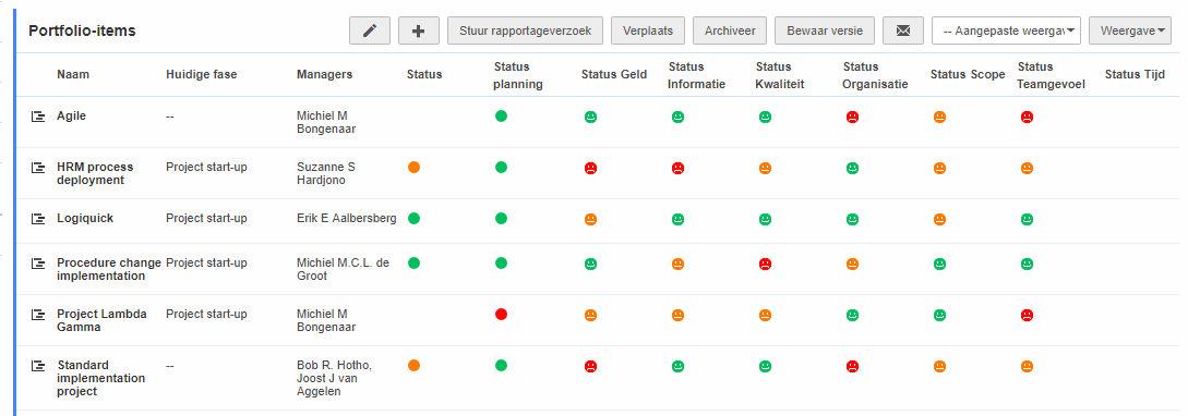
A design of Fortes Change Cloud with an abundance of status fields.
5. Consistency between indicators and company objectives
Know what you are steering. What is really important to you as a company? What does it mean for our success? The indicators you target in management reports will also be realized: "what you measure is what you get". But if the relationship between the company's objectives is not there or is unclear, it is difficult to get an indicator from red to green. The users of the management report will have to understand the consequences of the indicators and also know what to do if the results are lagging behind.
If you have any questions or comments regarding this article, please do not hesitate to contact We are curious about your experience.